
The Upcoming 21st Century Stagflationary Depression, Part 1
The Upcoming 21st Century Stagflationary Depression, Part 1
Part 1: Intro / Equities: Information Technology Sector.

Mark Twain once said “History doesn’t repeat, but it often rhymes”.
I’m what you call an Elliottician. I use a technical analysis method called Elliott Wave Theory to get a sense of where the price of financial assets and markets may move next. I let the charts tell the story because we’ve been there before. Times may change but people and their behaviors don’t. Greed and fear rules the market. Right now the charts are telling me a very grim story that I wish to share with as many as possible so they can prepare for what I believe will be a very rough chapter in modern history. I hope I am wrong but the more I chart the more confirmation and conviction I have that this analysis is correct.
Prerequisite Understanding
First and foremost to understand my writings you will need to have a basic understanding of Elliott Wave Theory. I recommend you read the Elliot Wave Principle by Frost and Prechter if you find some of the chart markings confusing.
Go get a free copy here:
https://www.elliottwave.com/free-reports/elliott-wave-principle
Here is quick a primer: https://www.investopedia.com/terms/e/elliottwavetheory.asp
Most basic rules: all markets move in 5 waves, 3 in the prevailing trend and 2 counter trends. Countertrends or “corrective waves” follow an ABC corrective pattern. A = initial correction, B = Bounce, C = Capitulation. Wave 1 is the initial discovery/early investment. Wave 2 is a corrective wave for early profit taking. Wave 3 represents mass adoption and tends to be the longest and strongest wave (but not always). One rule to remember is that Wave 3 just can’t be the shortest wave. Wave 4 is the next correction as early investors cash out as well as those who joined in wave 3 take profits. Wave 5 is the final mania wave or blow off top. This 5 wave structure occurs in varying timeframes or “degrees” and are present over hours, days, weeks, months, years, and even decades.

A Scary Chart
What blows my mind is that in the early 1940s, with war raging across the planet following the Great Depression, Ralph Nelson Elliott used his principles to predict a 70+ year bull market in equities. Given the structure one can clearly see that equities are at the end of the Super Cycle Wave (III) that began at the depths of the Great Depression and are approaching a Wave (IV) correction that is of the same degree as the declines seen in the 1930s. As you can see it will be bigger than the Great Financial Crisis of 2008-2009 as well as the Dotcom collapse. The implications of this are frightening. Banks could fail, job losses will soar, and debt defaults would rise to historic levels.
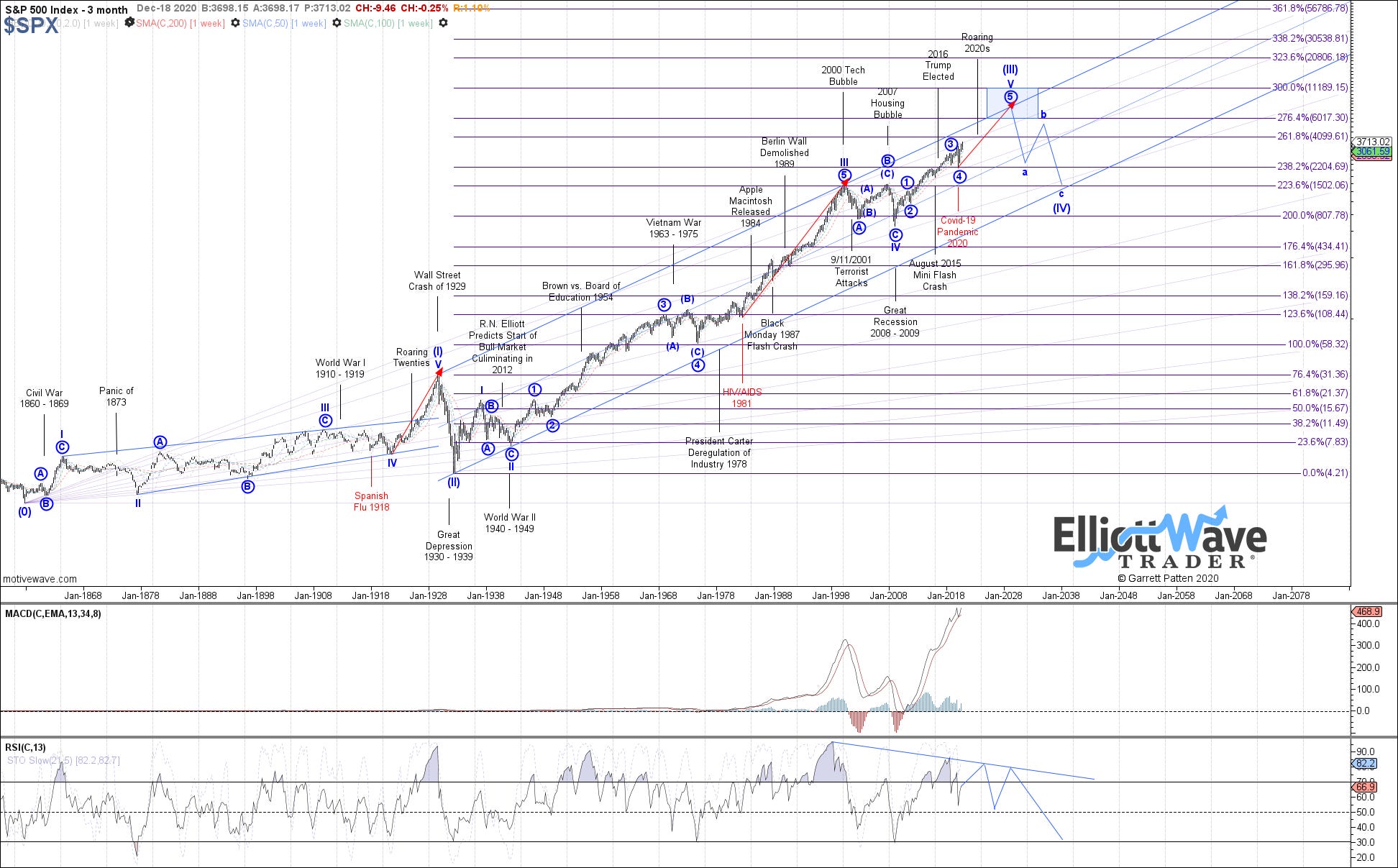
This chart was developed by one of the top Elliottician’s on ElliottWaveTrader.net founded by Mr. Avi Gilburt (who I consider the best Elliottician alive today). When I first looked at this chart a few years ago (which was posted numerous times on Seeking Alpha) I couldn’t believe it and fully denied it. But the scientist and engineer in me wanted to find out how accurate these wave structures are and prove to myself that they really did provide clarity on potential market movements. That was when I dug in deep into EW. I read all the books, signed up for Avi’s service and TradingView and began charting myself. One of the services offered there is a Beginner’s Circle where you can ask professional Elliott Wave Analysts questions and identify poor analysis. There is also a Stock Waves and Metals/Miners service available where subscribers can make chart requests. I went to work and began charting on my own. I would request a particular chart and see how well my own chart looked in comparison. After time and much trial and error, my charts started looking a lot like the analyst pros. To my amazement I found EW is quite accurate if done correctly. But how is this possible!? It is all based on patterned herding in financial markets. People buy financial assets with one purpose; to sell them to others at a higher price. The problem is that market participants don’t really know how to price financial assets. You can look at price to earnings ratios, sales growth, recent news, or any number of other financial data points but price may not always do what one would expect. There is something else driving price. When a stock sells off the investor will worry that he/she is wrong and will always have a tendency to follow the herd and sell when they should actually be buying or vice versa. Studies have shown that our brains are actually hard wired to do this. This is fully explained in detail in another book I highly recommend called The Socionomic Theory of Finance by Robert Prechter. Rick Rule does a great job explaining this phenomena at the 1:07:24 mark in this video when he compares buying mining stocks with cans of tuna fish.
This patterned herding is led by social mood and occurs in waves in varying degrees of time. One of my favorite diagrams that shows this behavior is below. I’ve marked it with wave numbers to show you key sentiment psychology for each wave.
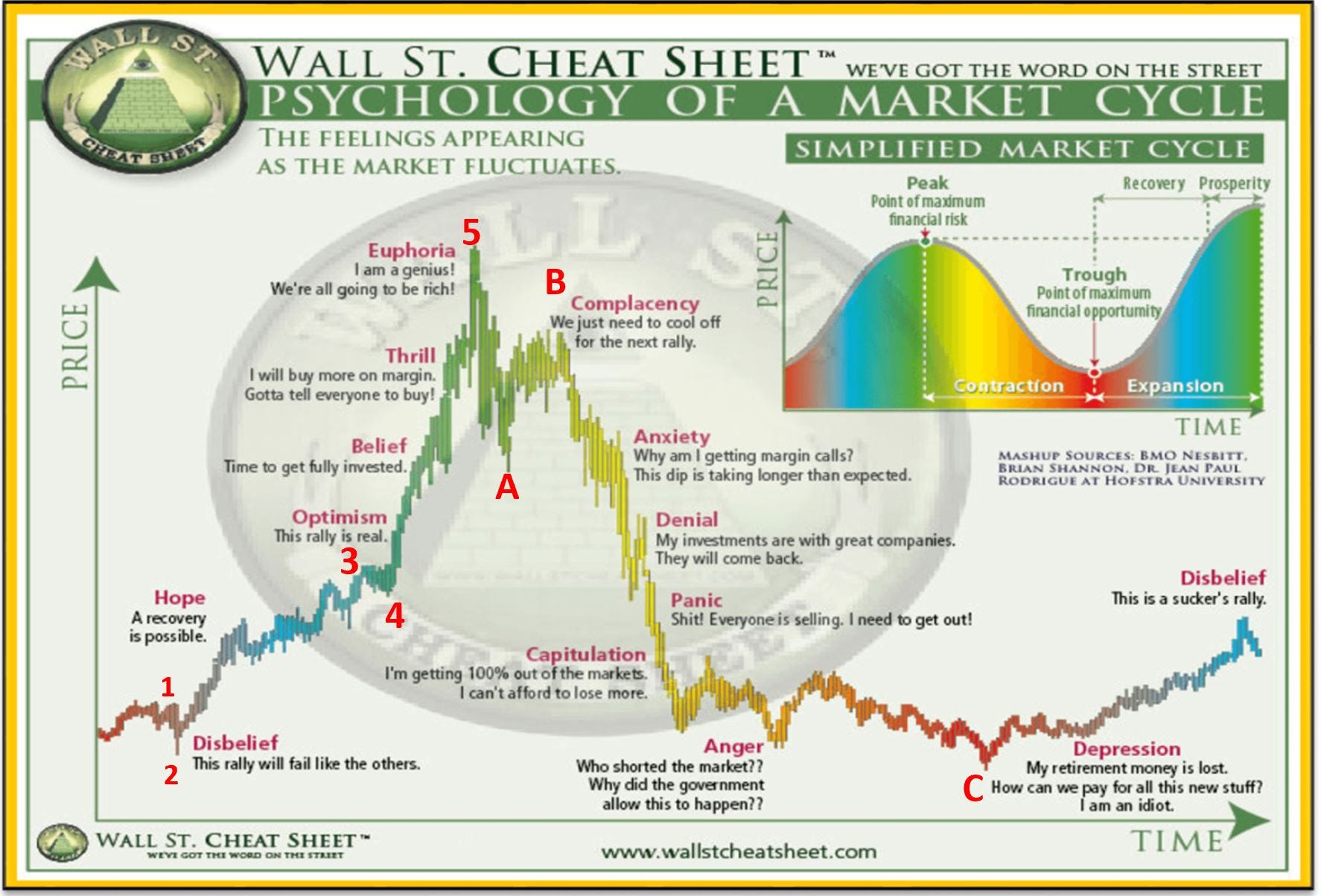
Elliott Wave along with sentiment indicators are extremely powerful if interpreted correctly. Please realize there is not any one technical method that is 100% accurate. EW seeks to determine highest probability outcomes only. If you think EW analysis is garbage then I would wonder why you are reading this in the first place.
So if you’ve made it this far, and are a believer in Elliott Wave technical analysis, let’s look at a few charts to see how things can play out in the markets in the next decade or so and perhaps make a few conclusions for what may occur.
Please note that none of this is financial advice. I am not a financial advisor or professional. Do your own diligence as these opinions are my own. This newsletter is here to help others and keep my own macro view on various assets in check. I want to buy low and sell high and help my family survive what lays ahead and have extra means to help others and pray that you will do the same.
Definitions
Stagflation - persistent high inflation combined with high unemployment and stagnant demand in a country's economy.
Depression - a steep and sustained drop in economic activity featuring high unemployment and negative GDP growth.
Both of these terms have a common denominator that is high unemployment. One would only need to look at SPX Wave (IV) and say to one’s self, “holy cow - that’s a Depression!” In a Depression, prices for everything drops as nobody has any money to buy anything. Supply demand economics takes over and as demand drops so does price as supplies increase. In this case, inflation would also drop as deflation takes takes hold and takes no prisoners. An economic depression is basically a deep and prolonged deflationary period.
Can an economy have both inflation and deflation at the same time? You bet! One only needs to look at the 1970s to see that. What I think is coming is worse. Its basically the worst parts of the 1970s stagflation and 1930s Depression combined together.

Some sectors and assets look to fare far better than others. Let’s begin looking at various assets one by one and see what’s going on here. I will begin with Equites in this letter and each following installment will cover a new sector or asset class. These will include all major sectors of the largest components of the S&P500, Bonds, Energy, Commodities, Currencies, International and Emerging Markets, and of course Precious Metals (my current favorite).
Equities
As you can see in the SPX chart there should be one more higher high to complete a the final 5 wave structure in the Intermediate, Primary, and Cycle for Super Cycle (III) before are larger bear market begins.

The SPX chart gives us an overall picture of the market as a whole but lets look at charts for major sectors of the economy and leaders to get a better view and to confirm what we see. We’ll be sure to include a handful of the largest weighted components.
https://www.slickcharts.com/sp500
Heck we may even get clarity on which industries/sectors will fair the best or worst in such an environment.
For this I’ll pick some leading companies from top industries that contribute to US GDP and perhaps a few ETFs if there is enough historical price data. For reference: https://largest.org/technology/industries/
Technology and Information Sector
GDP Share of Economy: 9-10%
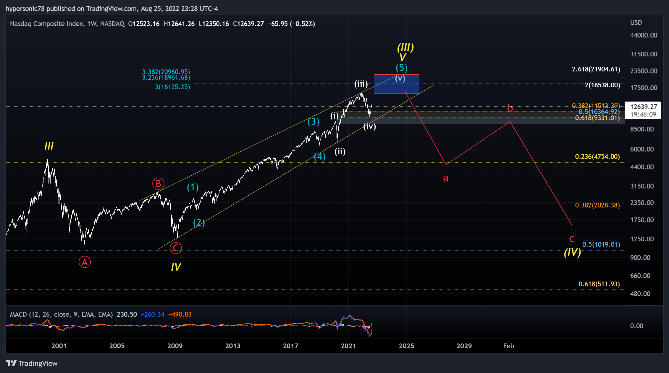
NASDAQ
The Nasdaq composite is super tech heavy with more than 50% of the companies being in the technology sector. Probably best to look at that chart first. Looks eerily similar to the SPX. One more wave up in a cycle high then down she goes.
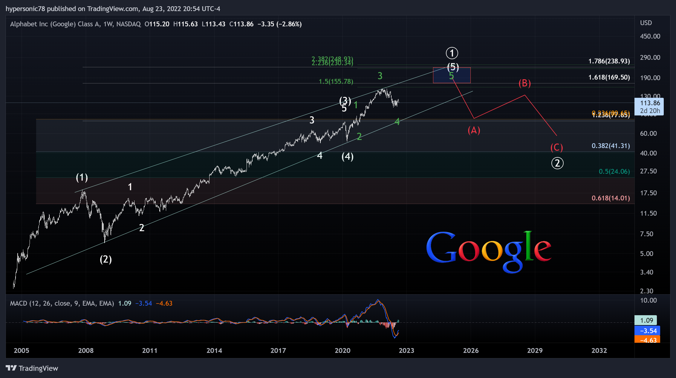
Google is finishing up Intermediate (5) of its first primary wave. Great buying opportunity ahead later this decade after a decent rinsing err I mean consolidation. What is the catalyst for Primary 2? Does internet advertising revenue take a hit as businesses cut back on spending? Definitely signs of deflation.
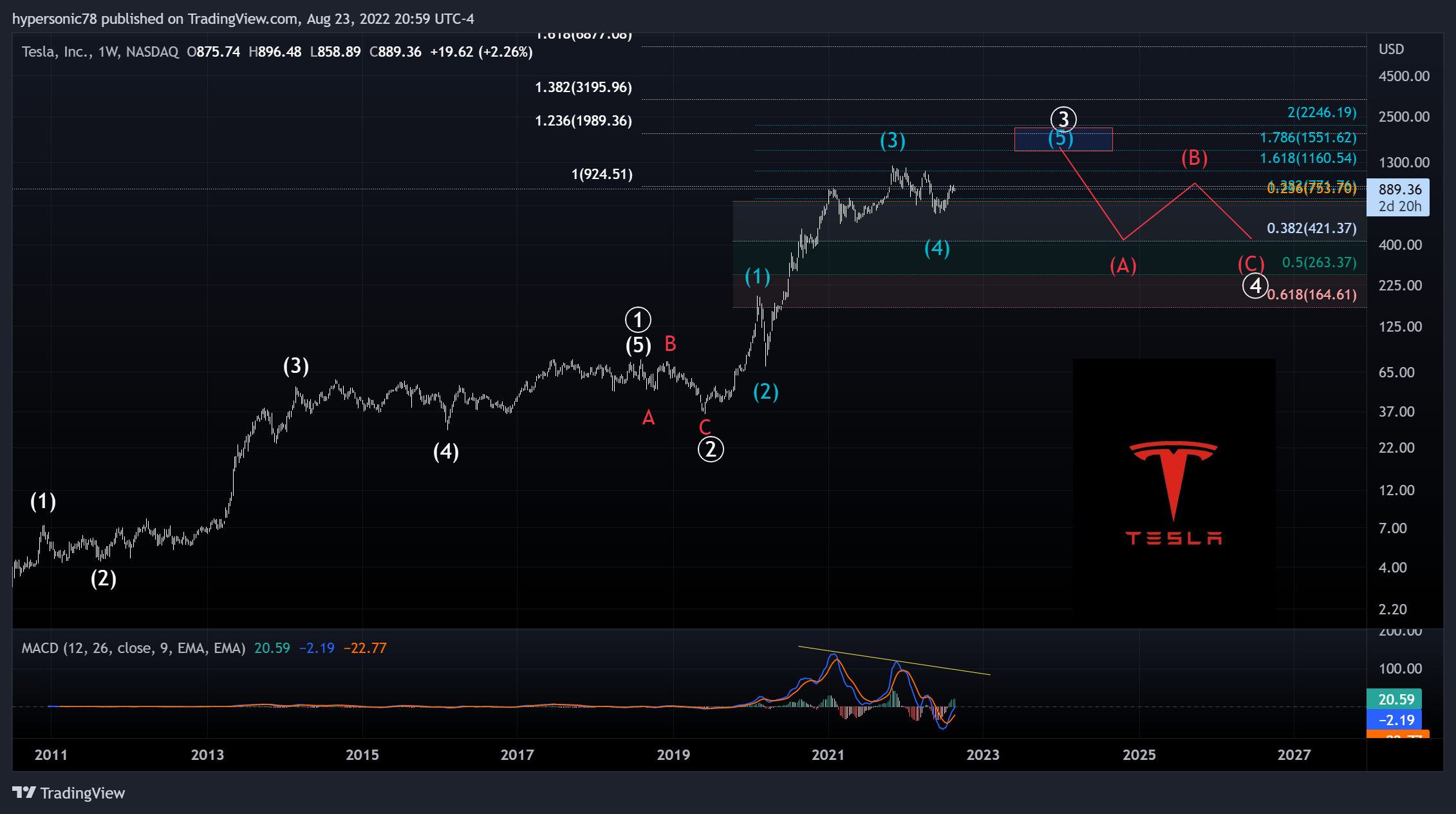
Tesla
TSLA also completing a 5 wave structure in Primary wave (3) that could double its price from here. Note the negative divergence. An Primary Wave (4) correction is expected thereafter which could cut the price in half or more. Wild ride indeed for shareholders. If this count is right then Tesla will have a bright future longer term which could be expected as more people buy EVs and Tesla bots take over more labor perhaps? Pure speculation but that’s what the waves are saying. This looks definitely impulsive but one needs be patient for P4.
Microsoft
MSFT is finishing up Intermediate (5) of Primary 5 of Cycle III. What an amazing run its had and it could still double from here depending on fib extensions. But once again and as we see in other technology stocks, there is a larger degree correction ahead.
Apple
Apple is the largest weighted component of the SPX and has started Minor 5, of Intermediate (5) of Primary wave 3. Primary 4 will likely retrace between the 23.6% and 38.2% as wave 4s have the tendency to return to the same level where the lesser degree was (Intermediate wave 4 of P3). Tells me many folks won’t be replacing their iPhones, iPads, and iMacs as often as they were this last couple decades.
Summary:
This looks bad so far doesn’t it? One more wave up first for the tech sector but definitely deflationary after their 5 wave structures complete. These charts are supportive of the Cycle Wave (IV) bear market ahead in SPX lasting years.
In Part 2, we will look at the financial institutions and insurance sector which are at the heart of the financial system and represent more than 7% of the GDP. Which banks are best positioned? Which ones will fare worse? It should be fun.
Until then,
Cheers and #EndTheFed
-Hypersonic78
Nice! How about applying EW to the historical spx/ppi chart? I'd be curious to see how that looks. (badcharts)
Thank you very much for your work, do you mind sharing how one could start learning EW?